Blog Carnival #13 Illustrations in RPGs

) on his personal page (english google translation). As you see in the title of this post, the topic is to write about illustrations in RPGs. First I want to talk about illustrations in general and their importance in RPGs and finally I gonna talk about the illustrations of Earthdawn and the progress that todays illustrations of the new RedBrick books have gone thru.
A picture is worth a thousand words
In RPGs it is mostly the gamemaster who uses illustrations. Why? Because sometimes his descriptions of situations or places the characters encounter can be as elaborated and detailed as they want, some players simply don’t get it or don’t remember that the small casket in the middle of the room was even mentioned. But the illustrations are essential for the gamemaster too, for example if he is simply not able to transport the mood and the danger the dark cellar room with the casket represents. As I already said “mostly” it is the gamemaster who uses illustrations of monsters or places to give the players a quick overview about what they see and how the characters might feel in that situation. As you all know “A picture is worth a thousand words”. But the same applies to players that should use their painting skills (if exisiting) to show the other players how their character looks like.
“Au contraire, mon ami!” or Imagination vs. Illustrations
RPGs, Pen and Paper games and all the “mostly” unplugged games that can be played, are build on the ability of humans to use their fantasy and imagination. So what happens if you use illustrations and drawings in those games? Yes, the imagination and the individual style everyone has in its own head is forced into a given picture that someone else had in mind and brought it to paper. Ergo, the excessive use of illustrations can prevent players from using their imagination and even gamemasters will lose (or even not learn) to describe situations and transport moods and feelings the characters need to be aware of.
Those two theories above show that gamemasters have to decide carefully when illustrations are useful and when they are simply used because of laziness.
Now and then
Well, Earthdawn. When I started to play Earthdawn (I talk here about the German edition), the main artist that shaped Earthdawn (art wise) for me, was Jeff Laubenstein. His individual style is/was unique and his b/w drawings of the discipline example characters gave everybody a feeling for Earthdawn. (Sorry can’t explain it better). BUT!! (you know that there is always a BUT) in the German edition were 32! colored, high gloss paper pages included. 8 that detailed every race, 8 that showed special places of Barsaive, 8 contained important persons and finally 8 colored monster illustrations were published in those core books.
For every beginner those pages were the icing on the cake. They gave you almost more than the whole descriptions and rules of the core book could give you.
And that is the point, today there is nothing colored inside the books anymore. The covers are the only colored illustrations. No one can be blamed for that, because the price of the books would be more than exaggerated if there were high gloss paper illustrations included. But imagine the following situation:
“A fan comes to his trusted RPG store and grabs the Earthdawn core book (no matter which one), flips through a few pages and ………”Now guess where he will stop to flip through the pages? Exactly, at the pages with the illustrations. To give players or gamemasters a quick introduction to the gaming world and an insight into the book he holds in his hands, good colored illustrations are a must.
Progress of Earthdawn illustrations
In the beginnings of Earthdawn Jeff Laubenstein was, in my opinion one of the main artists that shaped Earthdawn with his illustrations, mainly the interior art. There were also others that are still appreciated for their work but when Living Room Games published their Second Edition, the drawings and interior art of the books “changed”. Today it is Kathy Schad who is responsible for the artwork and art direction of RedBricks Third Edition sourcebooks.
The progress Earthdawn has gone thru was influenced by the changing of companies that published Earthdawn and the various people who were responsible for the artwork. Finally the copyrights ended up in RedBrick LLC’s hands and the times when different copyright holders made different artwork for Earthdawn are over now. Today official Earthdawn art has a common theme and you can be sure that it comes from one company. I guess the progress of the cover and interior art has not ended yet and maybe we will get to see some colored interior pages in future
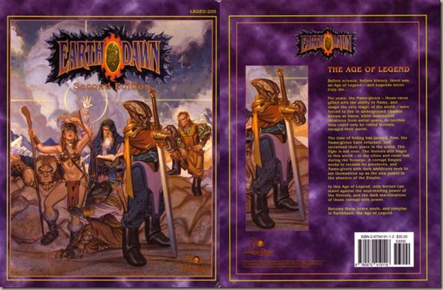
And now watch for yourself how Earthdawn cover art changed over the years. As I already said: “A picture is worth a thousand words”


 Friday, August 13, 2010
 Mordom
, Posted in


Many thanks for the post! I can say that you've just made my day, although it's Friday 13th ;)
As for illustrations in Earthdawn, I can't wait for Cathay. As far as I know most of RedBrick's artwork budget goes for that. And we will see Laubenstein's comeback. So it's definitelly worth waiting till December.